Empty States
Empty states occur when there is no available data to display.
DetailsProperties
Empty states can occur when:
- a user is setting up or using the product for the first time.
- data is deleted, unavailable, or nonexistent.
Possible elements of an empty state include:
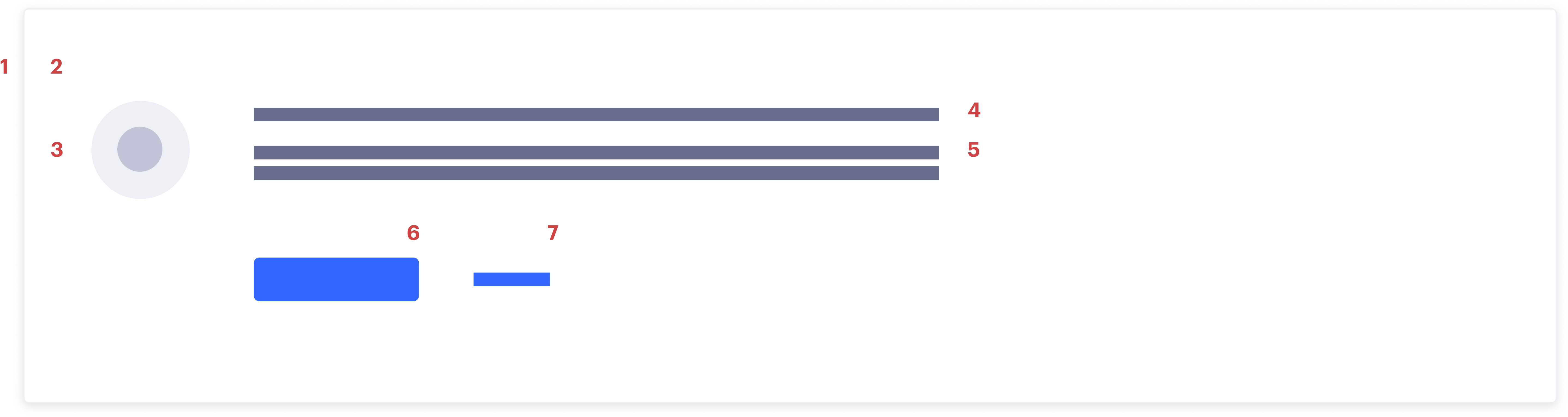
- Border
- Background
- Visual. Icon that relates to the situation at hand.
- Headline. Use to explain the situation at hand.
- Body (optional). Use to direct users and explain how the user can populate the screen.
- Primary CTA (optional). Use to help the user take an action to resolve the empty state.
- Text link (optional). Use to provide additional user support, like documentation.
Most empty states in Segment fall in one of four categories:

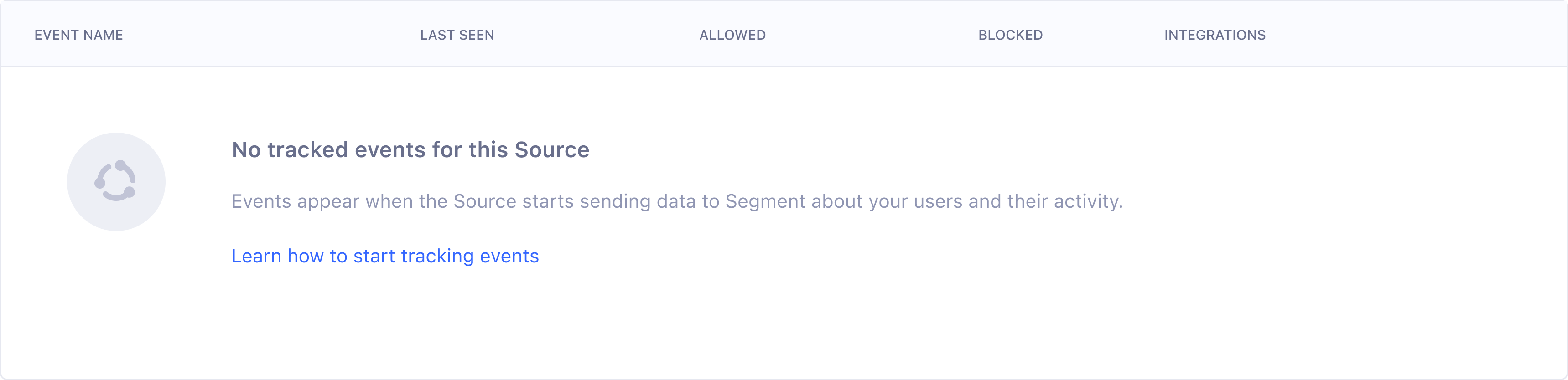
Segment often shows users tables with large data sets. When the data in these tables is either unavailable or nonexistent, maintain the table header in the empty state to provide additional context and set expectations. For example, if a table of tracked events isn’t populated yet, the empty state within the table shows the user what event data event will eventually populate.
Event NameLast SeenAllowedBlockedNo tracked events for this Source
Events appear when the Source starts sending data to Segment about your users and their activity.
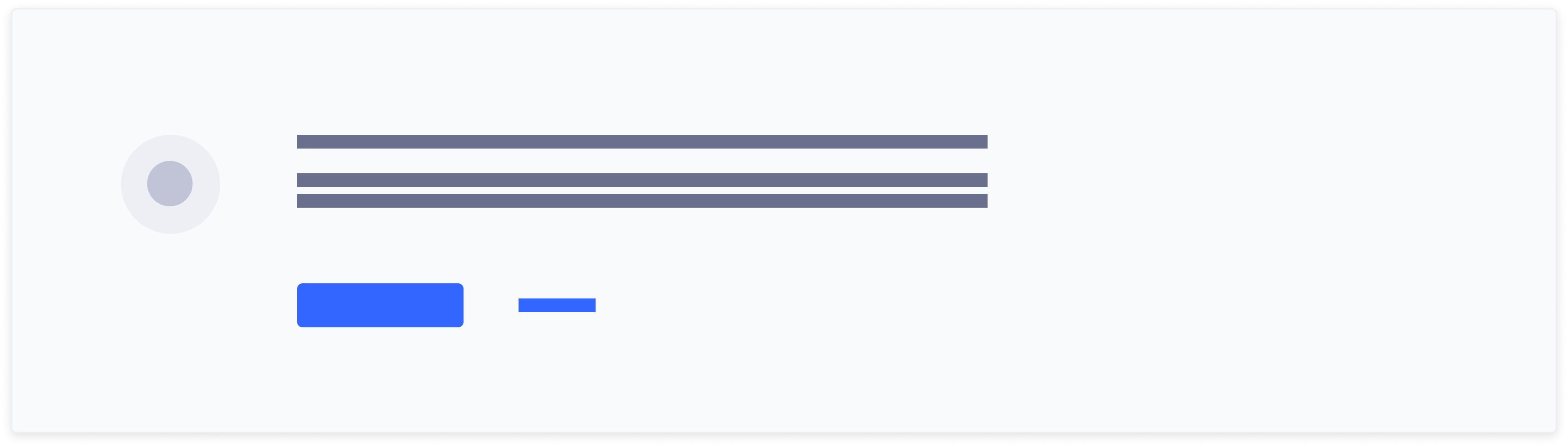
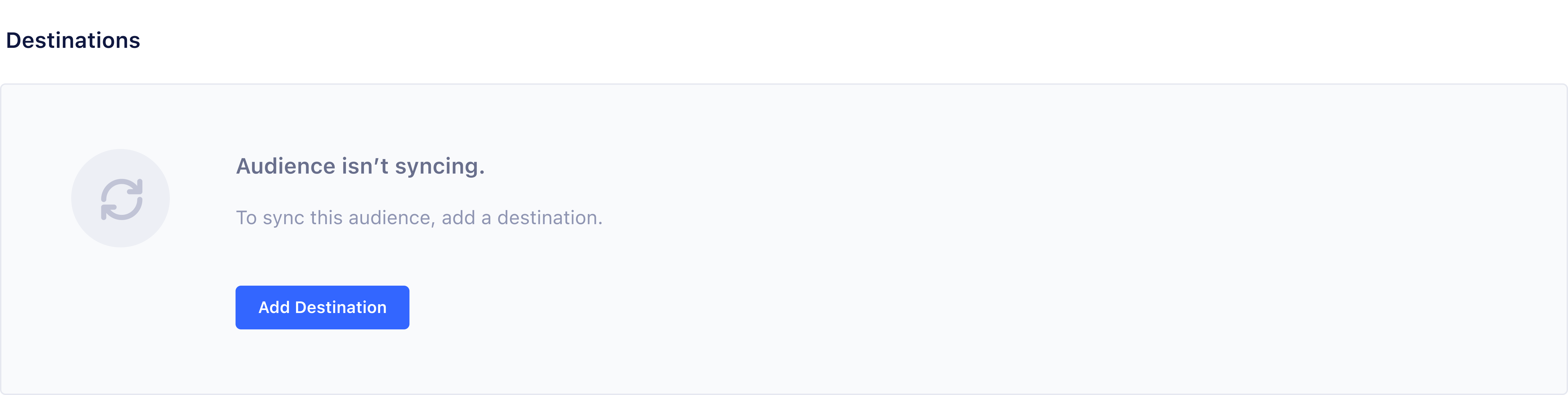
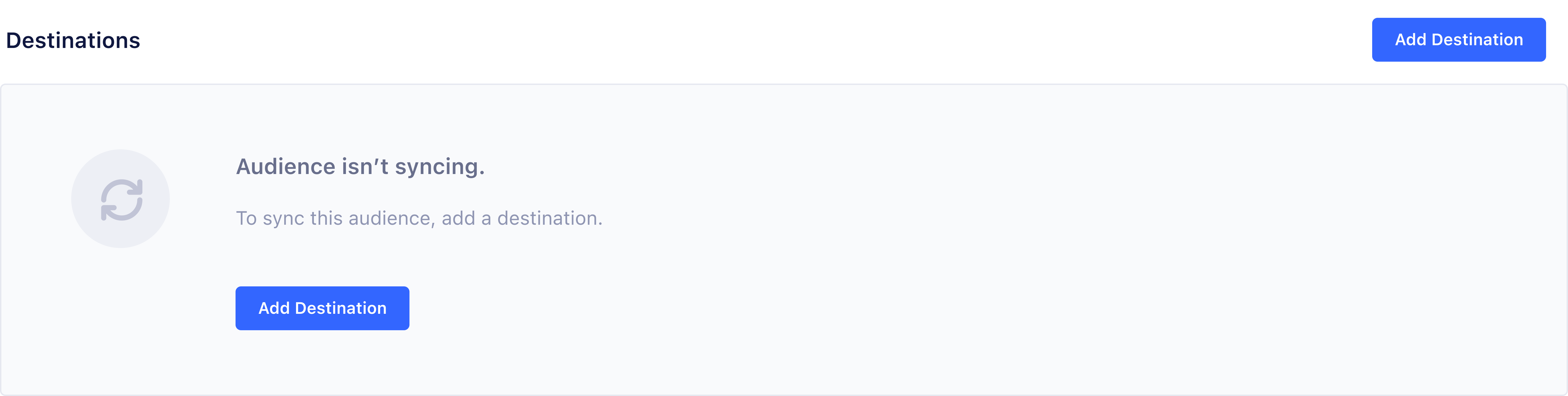
Empty states for content outside of a table include a background color to create variation on screens where there are multiple empty states or when an entire screen is blocked. For example, if an entire screen is blocked because a user doesn’t have the necessary permissions, a background is added to the empty state to create contrast and containment.
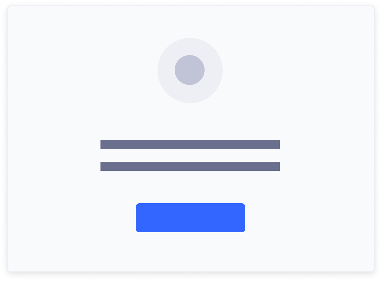
When design real estate is limited, consider using a small empty state.
The smallest acceptable empty state uses only a visual and headline. Minimal empty states typically occur in small components, like drop downs or side sheets within tables.
Do
Use a primary button if the action allows the user to resolve the empty state.
Don't
Offer a CTA twice on the same screen. Hide the top line primary button when the action is redundant.
Do
Consider a text link to provide additional information if a button cannot resolve the empty state.
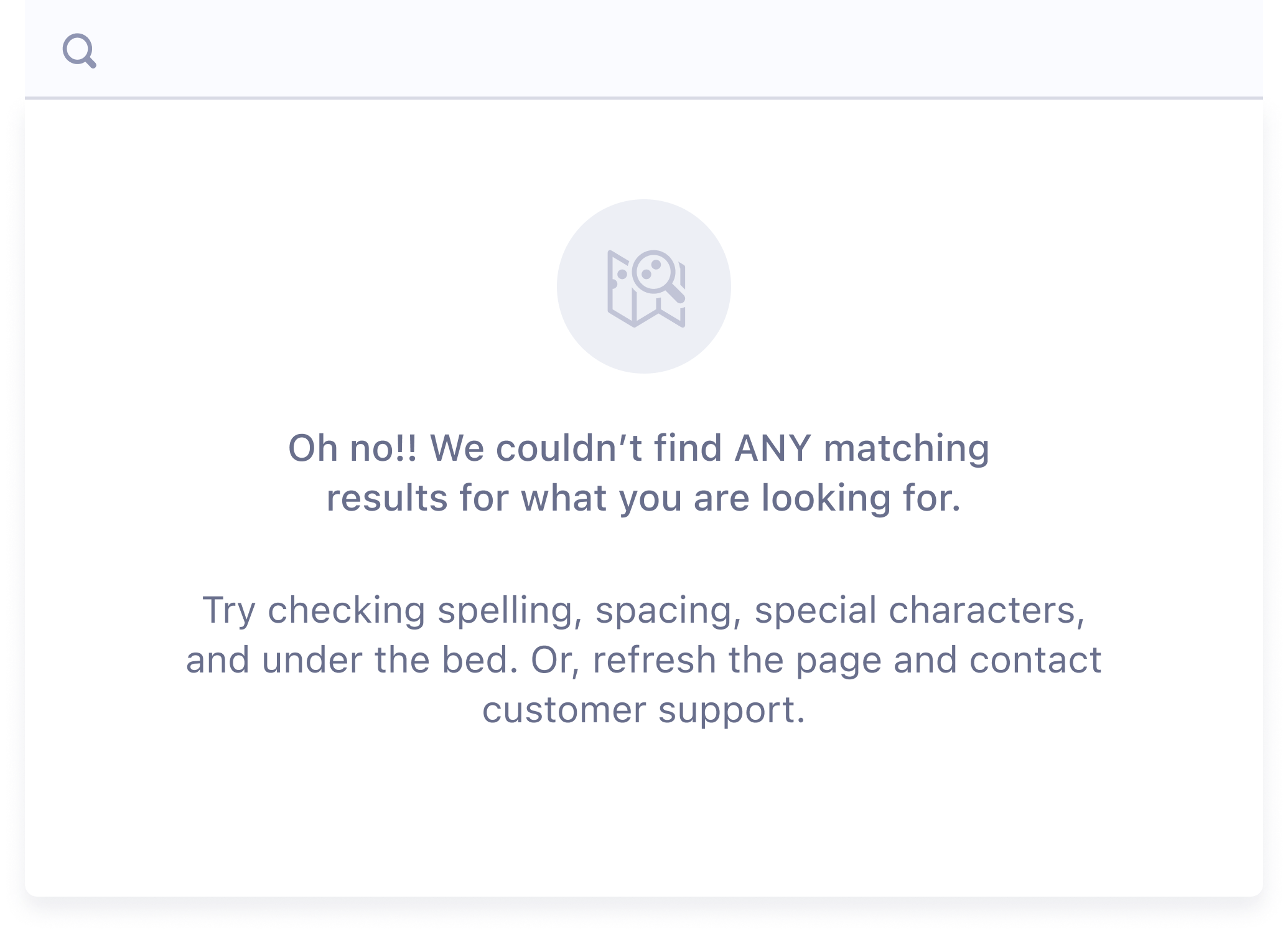
Empty state content should explain what information or data isn’t being showed, and how to change the empty state to a populated state.
Limit headline text to one line. Since users typically skim online content, the headline should contain the most important information.
- For an onboarding experience: Explain what eventually populates the empty state.
- For an error experience: Explain what went wrong.
- For a no results/data experience: Explain what happened.
Limit body copy to two lines. Use the body copy to introduce additional information about what the user can do with this UI element.
- For an onboarding empty state: Describe how a feature works or what will happen when they use it.
- For an error empty state: Explain how the user can fix the error.
- For a no results/data experience: Explain what they can do to try and get a different outcome.
Buttons and link text should set expectations for the user.
- Button text should reflect what will happen when the user selects the button.
- Link text should reflect what kind of info the user gets at the destination.
Tone should be educational and plain-spoken.
Do
Use an educational and plain-spoken tone.
Don't
Use excessive emotion or exceed 1 line for headline and 2 lines for body.